The covers that taught me to love lettering
I’m using hand lettering more and more in my sketchbooks. The titles are becoming part of the drawing rather than something I simply add afterwards.
It made me think about where that came from.
During the 1980s I worked in publishing at Tafelberg in Cape Town. I was surrounded by remarkable book designers. At G&G Design, Herman Koch and Abdul Amien produced beautifully crafted literary covers, while Willem Jordaan created the distinctive Boekewêreld and Bogtery covers that I admired just as much.
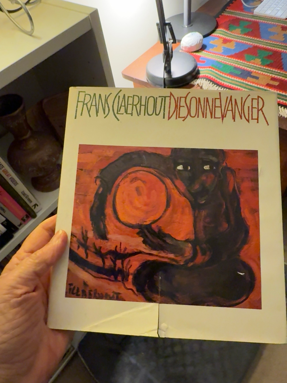
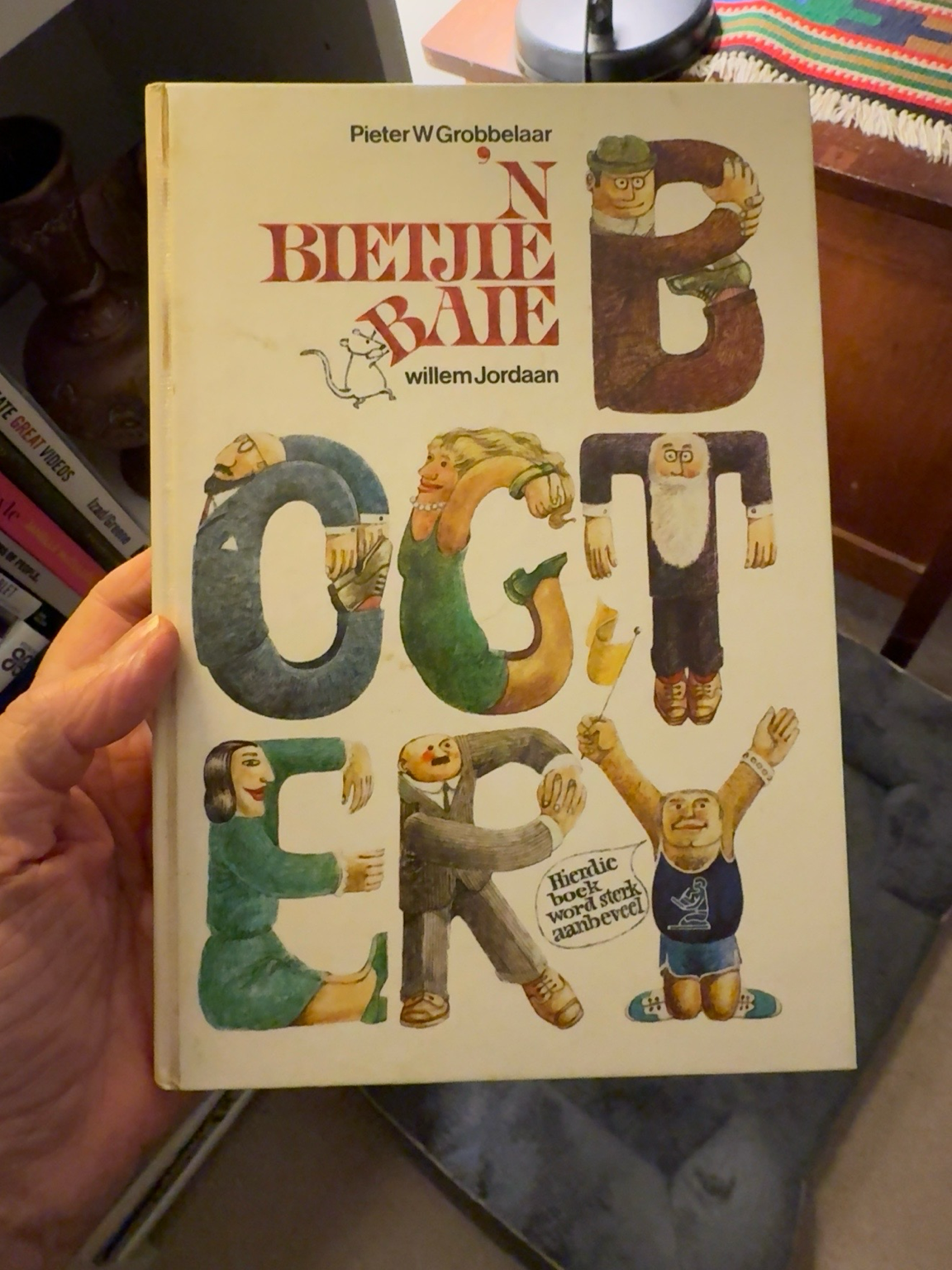
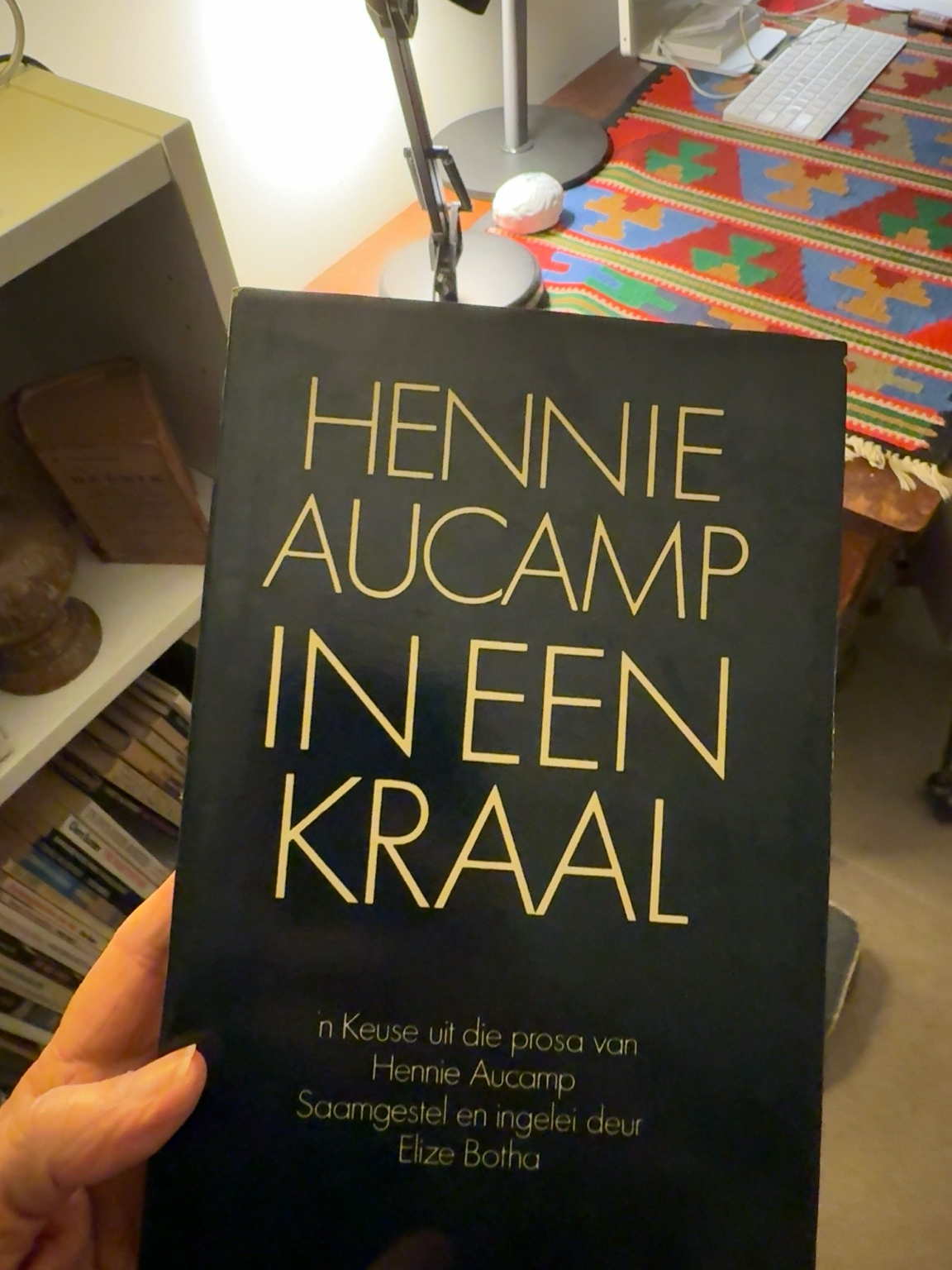
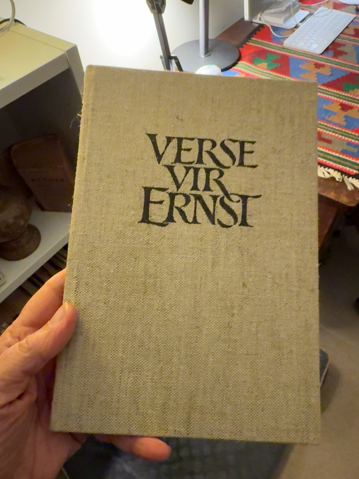
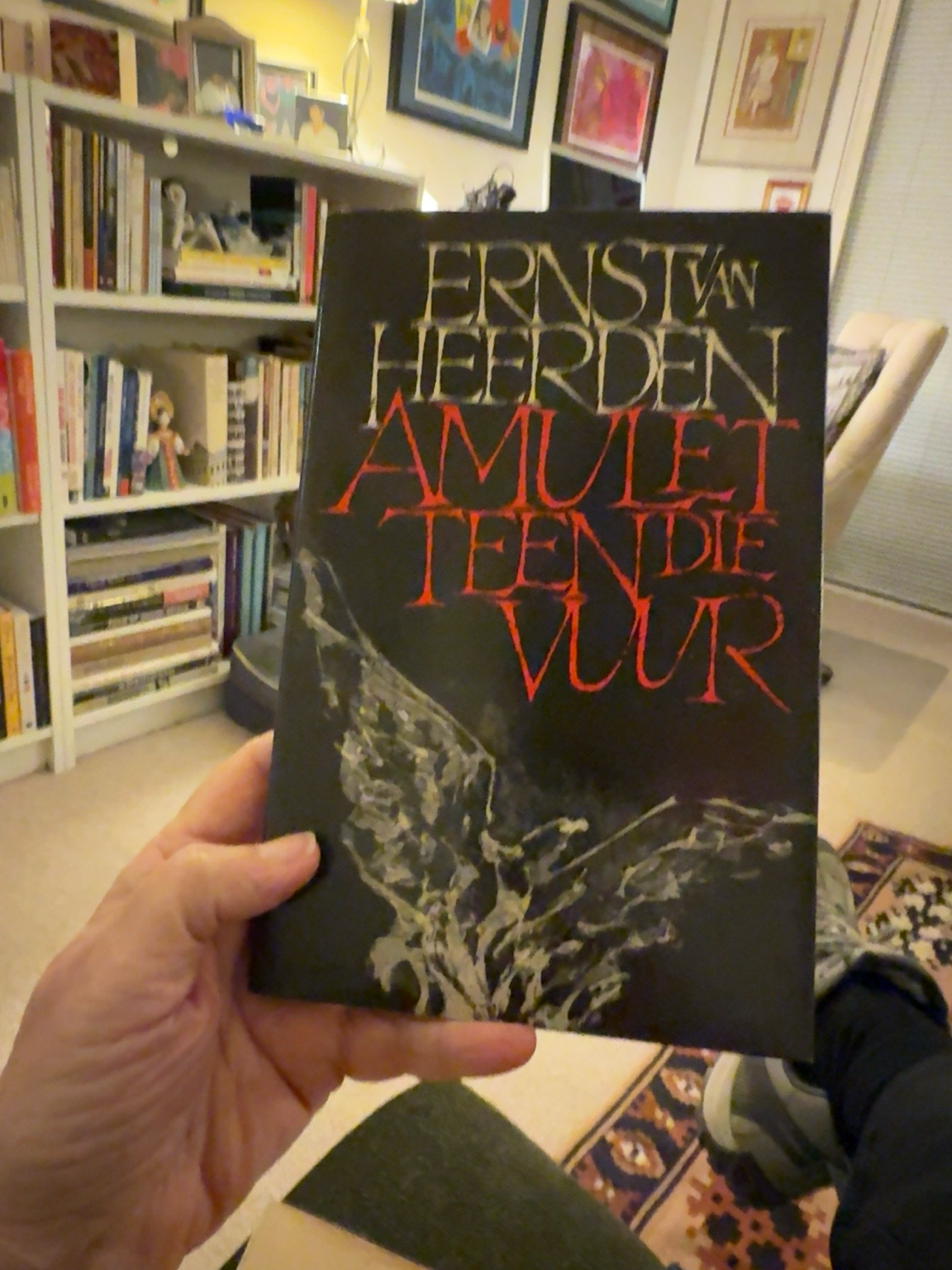
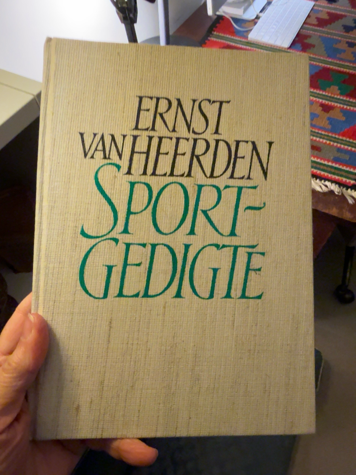
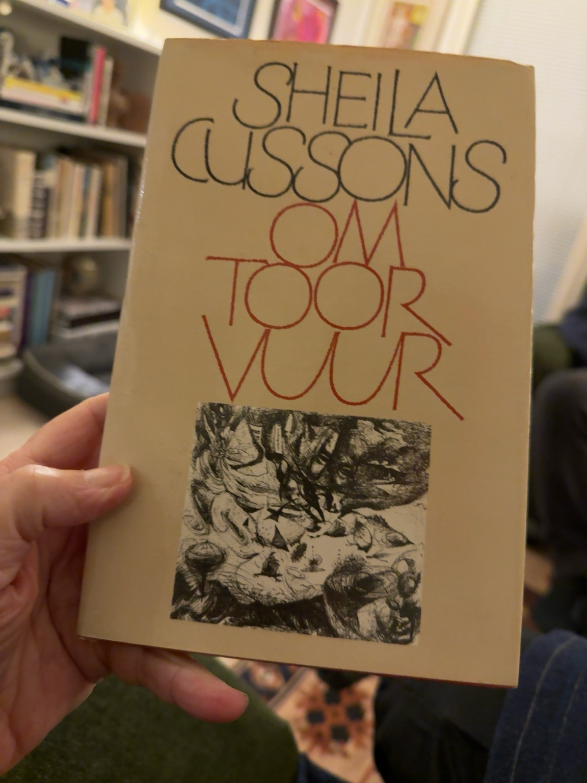
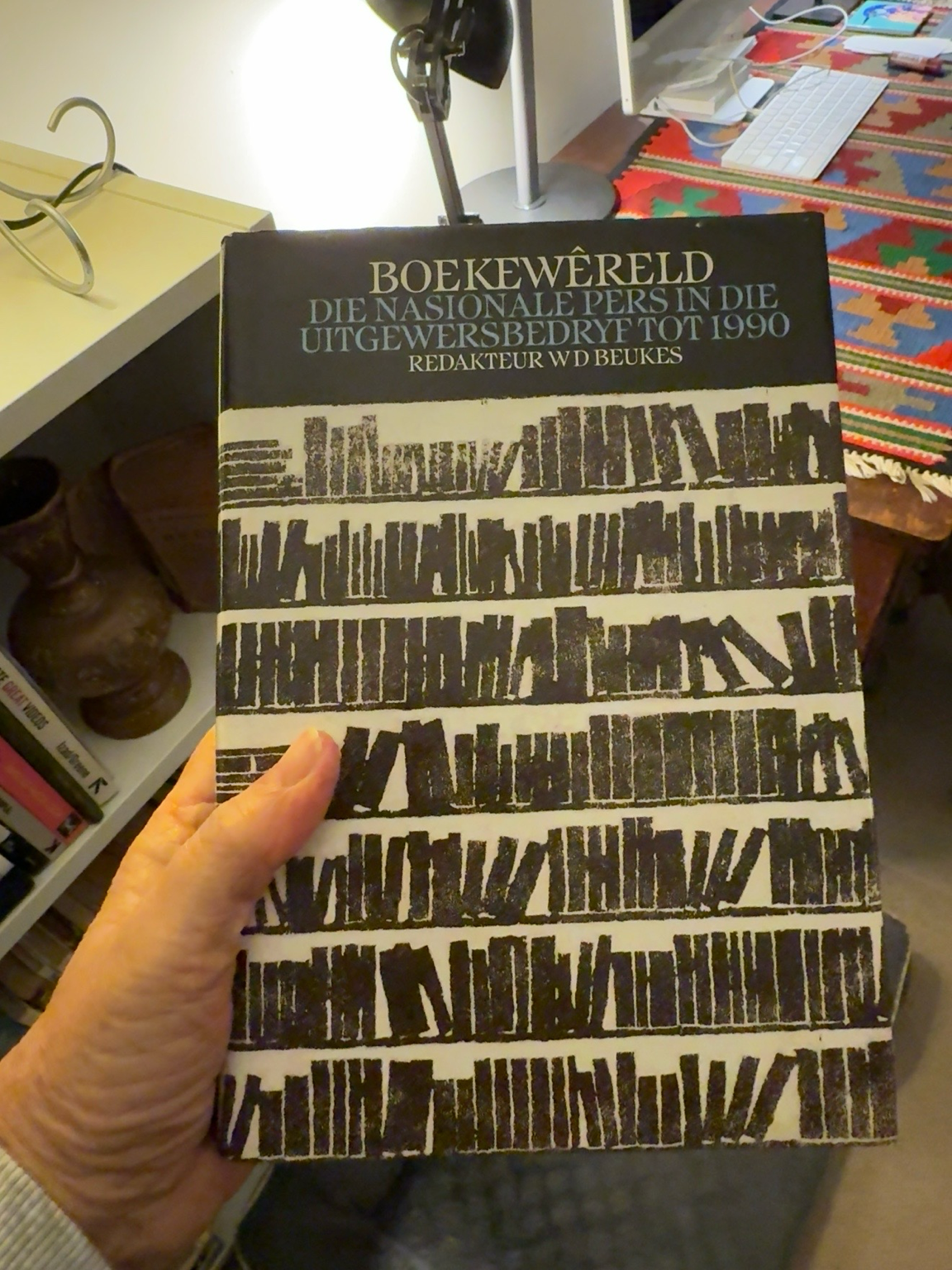
I remember being slightly intimidated by the precision of their work. Every letter, every space and every line seemed perfectly judged. At the time I simply admired the finished books. I didn’t realise they were quietly shaping my own eye for design.
Looking through my bookshelves today, I can see that influence everywhere.
Perhaps that’s why lettering has found its way into my sketchbooks. It isn’t just there to identify a drawing. Increasingly, it becomes part of the composition and helps tell the story.
It’s funny how visual influences stay with us. Forty years later, those book covers are still teaching me how to see.